How to create a strong visual brand
- Phoebe Nguyen

- May 13, 2021
- 3 min read
Updated: May 29, 2021

During the month of May 2021, I'm intensively working to launch my home cupcake business, 'Phoebe's Cupcake Treasures'. My main focus will be on social media marketing and managing the business' finances. The entire project is a massive and exciting challenge, since I'll be learning a ton of entrepreneurial skills and monetizing my baking passion. This blog post is one aspect of my project. Please click here to see the rest of it!
One of the major tasks during the early stages of building a business is sorting out the visual branding of it.
What is visual branding?
In essence, visual branding is the visual elements that are used to represent your business. It’s the logo, the fonts, and the colours you use on your website.
The first impression I get from small businesses without cohesive visual branding is that they are less ‘legit’ or unprofessional. This is why I believe having a strong visual brand is important, and that I’ve given a lot of thought into the visual aspects of my cupcake business. In this blog post, I give you some simple tips on how to build a cohesive visual brand, which I’ve learned through experience.
How to create a strong visual brand for your business
The three major elements that make up a business’ visual brand are: the logo, color palette, and font styles.
The logo
1. Make sure it conveys what your business does.
Since my business is small and doesn’t have the level of recognizability as the Nike tick, I made sure that my logo clearly indicates what my business sells. By including a graphic of a cupcake in my logo, a customer who has never heard of my business before would still know exactly what I do.
2. Choose a business name that evokes connotations representative of your business.
By doing so, customers will be able to better grasp what your business is about. For example, I chose to use the word ‘treasures’ in my business name and logo. My unique selling proposition is that I create fancy gourmet cupcake flavours that aren’t commonly sold at other cupcake stores. The word ‘treasures’ effectively encapsulates the premium nature of my products.

The color palette
1. Less is more.
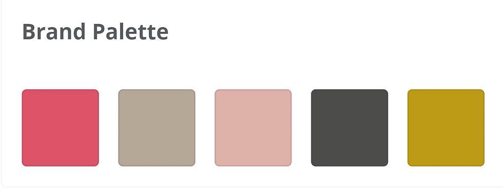
My color palette only consists of five colors, and I think it’s not necessary to have more. Since it may be difficult to come up with a solid color palette out of thin air, I suggest scrolling through Pinterest for inspiration and playing around with Canva.
2. Consider color psychology.
Whilst I created my color palette mostly because I like how the colors look, it’s helpful to consider the emotions that your colors convey. For example, I chose to use a gold-ish shade as an accent color because gold is often associated with luxury and elegance. This is perfect for my visual brand since I want customers to perceive my cupcakes as a premium baked good, and that it makes a perfect gift.

The fonts
1. Use easy-to-read fonts
Just don’t make it difficult for customers to read your text. It’s not pleasant.
2. Keep the target customer in mind.
The fonts your business uses for written communication forms part of your visual brand, so it’s beneficial to consider what a font style conveys. My target customer is an adult, so Comic Sans would be the worst font to use as it appears to be child-ish and tacky. Instead, I’ve chosen Serif fonts because they seem more elegant and ‘mature’, which would better resonate with my target customer.

Tying it all together
Once you’ve settled on a logo design, color palette and font styles, it’s important to incorporate them consistently throughout your business’ marketing. This will more effectively convey what the business represents to the customer. Having a different color palette for your website and business cards will be confusing to the customer, as they won’t be able to gain the same overall feel or look to your business.
Canva has a function called ‘Brand Kit’ that makes it easy to keep your visual branding consistent when doing graphic design. In this two-minute video, I walk you through how to use the Brand Kit function on Canva.


Comments